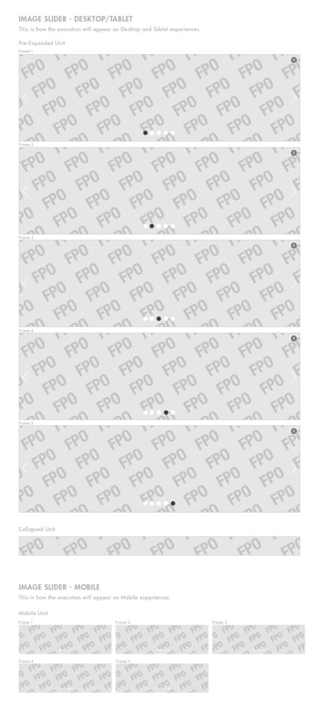
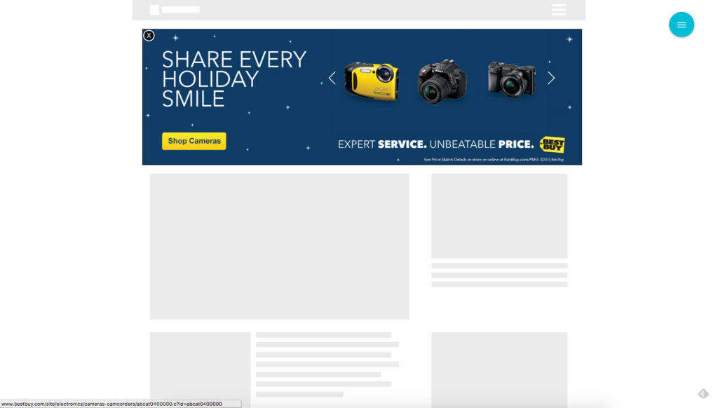
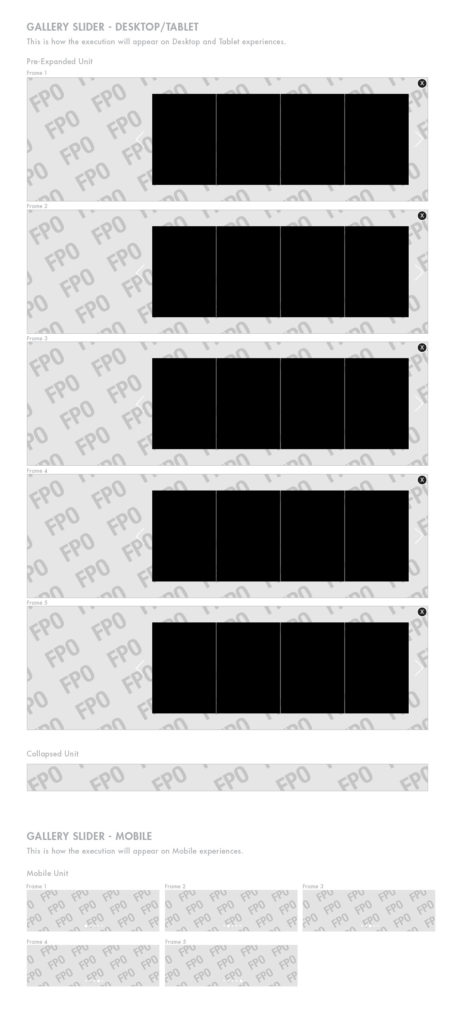
With Slider, we created a flexible unit that could be used to push various types of content.
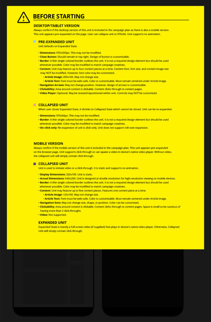
The unit began auto-initiated at a slightly larger than standard size (970×300) and was collapsable to (970×66). It’s layout was fairly flexible allowing for a variety of ways for the space to be utilized.
Although we created a single “Slider” unit, we differentiated it into three groups: Image, Gallery, and Content. Each minor variations of each other, it allowed our sales teams more flexibility for concepts to adapt for a variety of advertisers. The “Content Slider” version of the product was perhaps the most unique as it was able to dynamically pull in feeds from any number of our own publishing platforms with the newest most relevant article topics.
I helped to spec out the unit with a focus on ability to quickly recreate the unit for any number of advertisers. This included making templates and spec sheets that helped ensure the unit would quick to create even with completely customized designs.
Collaborating with Product Managers, Developers, and Internal Stakeholders, I helped to shape the specs, dimensions, user interface, and user experience for this unit.
Image Slider
Desktop
Mobile
Template
Gallery Slider
Desktop
Mobile
Template
Content Slider
Desktop
Mobile
Template
Acknowledgement
I do not make any ownership claim to the copyrighted works shown on this page.
- CREATIVE DIRECTOR: Manuel Donayre
- DESIGN LEAD: Jose Inigo
- PRODUCT OWNER: David Denton
- PRODUCT LEAD: Joanne Chang


