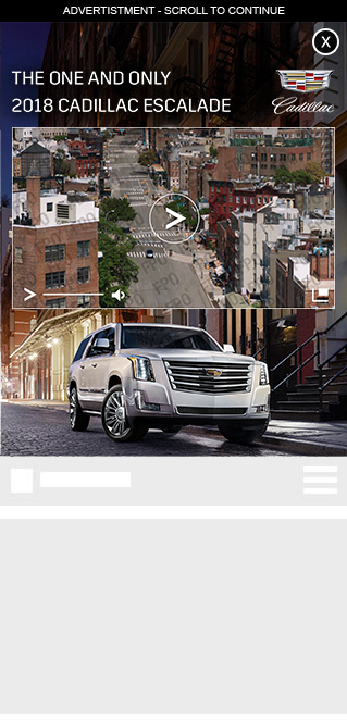
With Overture, we created a fully-responsive, cross-device unit that could adapt to be viewed on any number of screen types and sizes.
The unit began auto-initiated and was uniquely situated at the very top of the page and was collapsable to smaller size.
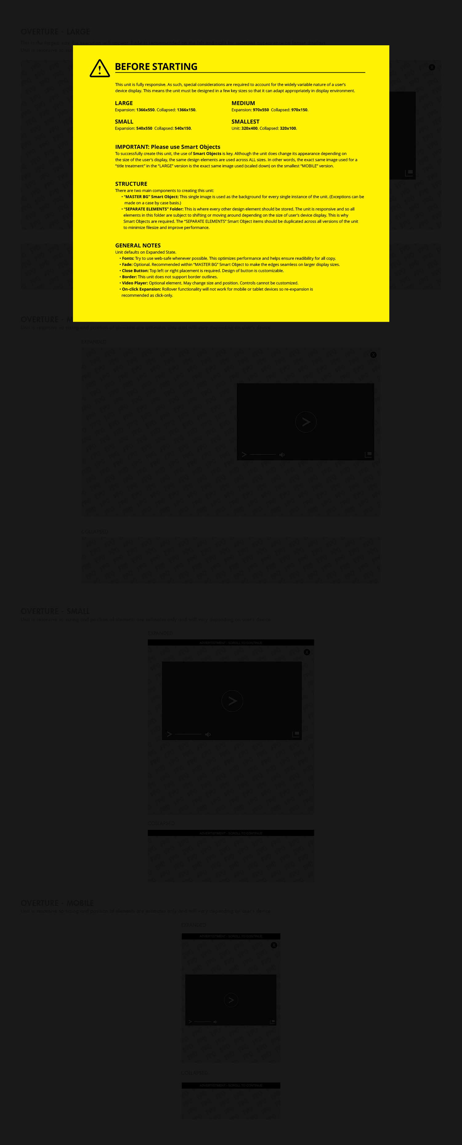
The challenge for this unit was to develop a means of getting creative approvals by clients for a unit that does not have consistent size. What we landed on, using audience metrics from our various publishing platforms, was four total breakpoints upon which the unit was based: Small, Medium, Large, and Largest.
Utilizing Photoshop Smart Objects we were able to create units that flowed and adapted between various screen sizes and devices that utilized a minimal number of assets. In some instances we were able to populate all four breakpoints with the exact same assets, minimizing load time and bandwidth consumption for the user.
Collaborating with Product Managers, Developers, and Internal Stakeholders, I helped to shape the specs, dimensions, user interface, and user experience for this unit.
Desktop


Mobile

Template
I devised a PSD template with all the pertinent notes and details so that new designers or third party designers could easily create the unit exactly to spec each time.

Acknowledgement
I do not make any ownership claim to the copyrighted works shown on this page.
- CREATIVE DIRECTOR: Jose Inigo
- PRODUCT OWNER: David Denton