Doing any sort of design work for yourself is quite possibly the most challenging of all. You are your own client which makes you the best and worst client of all time. You demand perfection and you want it quickly.
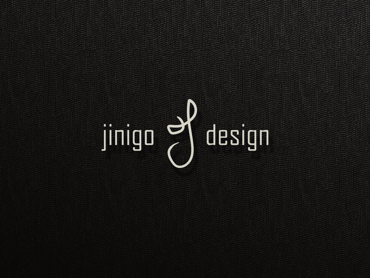
I have always liked the unusual shape that the cursive “J” from my signature has looked. To some it can look like a right-pointing face with a critical eye. I liked this idea to represent myself first and foremost as the “J” represents my first name but also the idea that the critical eye is looking forward.
I wanted a simple but non-standard font to represent the type, slightly geometric but not perfectly angular. Clean and well presented but not typical. Like me.
The background was another personal challenge. I knew I wanted something sleek and minimal and ultimatelly landed across this fabric texture quite accidentally while sorting through pre-fabricated patterns. It felt to me modern yet completely retro, too.
Animated Logo
I collaborated with a Video Graphics Animator (Hugo Banda) to take my design and turn it into an HD animated video that could be used for my personal video graphics. I storyboarded the animation in Photoshop and exported it as an animated GIF for Hugo to use as reference. It is used as the intro and outro for the various videos on my portfolio. One of those videos can be found below:
Acknowledgement
I do not make any ownership claim to the copyrighted works shown on this page.
- DESIGN / DIRECTOR: Jose Inigo
- ANIMATION: Hugo Banda