In support of the launch of Canadian mobile marketing solution company, Apex Mobile, I oversaw creation of logo and brand identity.
I worked remotely with the operations manager and head of sales to identify audience, landscape, competitors, and general tone of the brand.
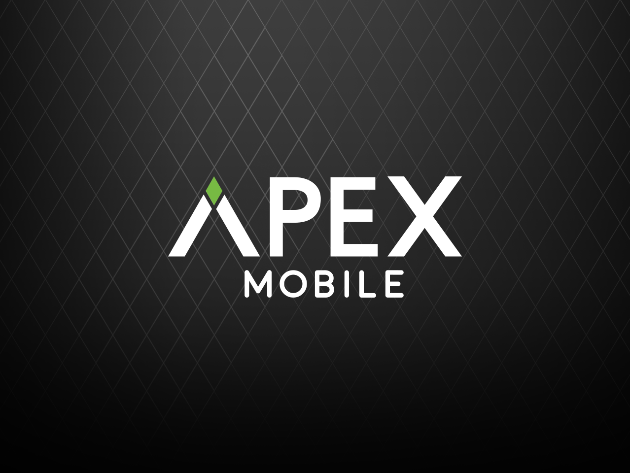
Collaborating with a team of designers in Mexico and Serbia, we honed in on a design variation that played off the idea of “apex” as a peak or a mountain. A diamond seemed like an upscale motif that could represent flexibile mobility in any direction. We also liked the idea of the diamond blinking like a notification indicator in a mobile device.
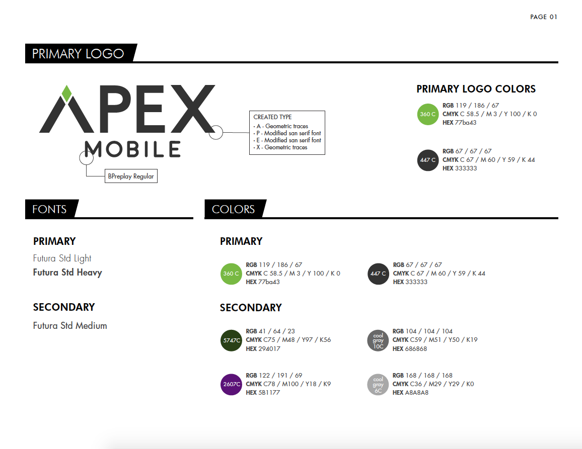
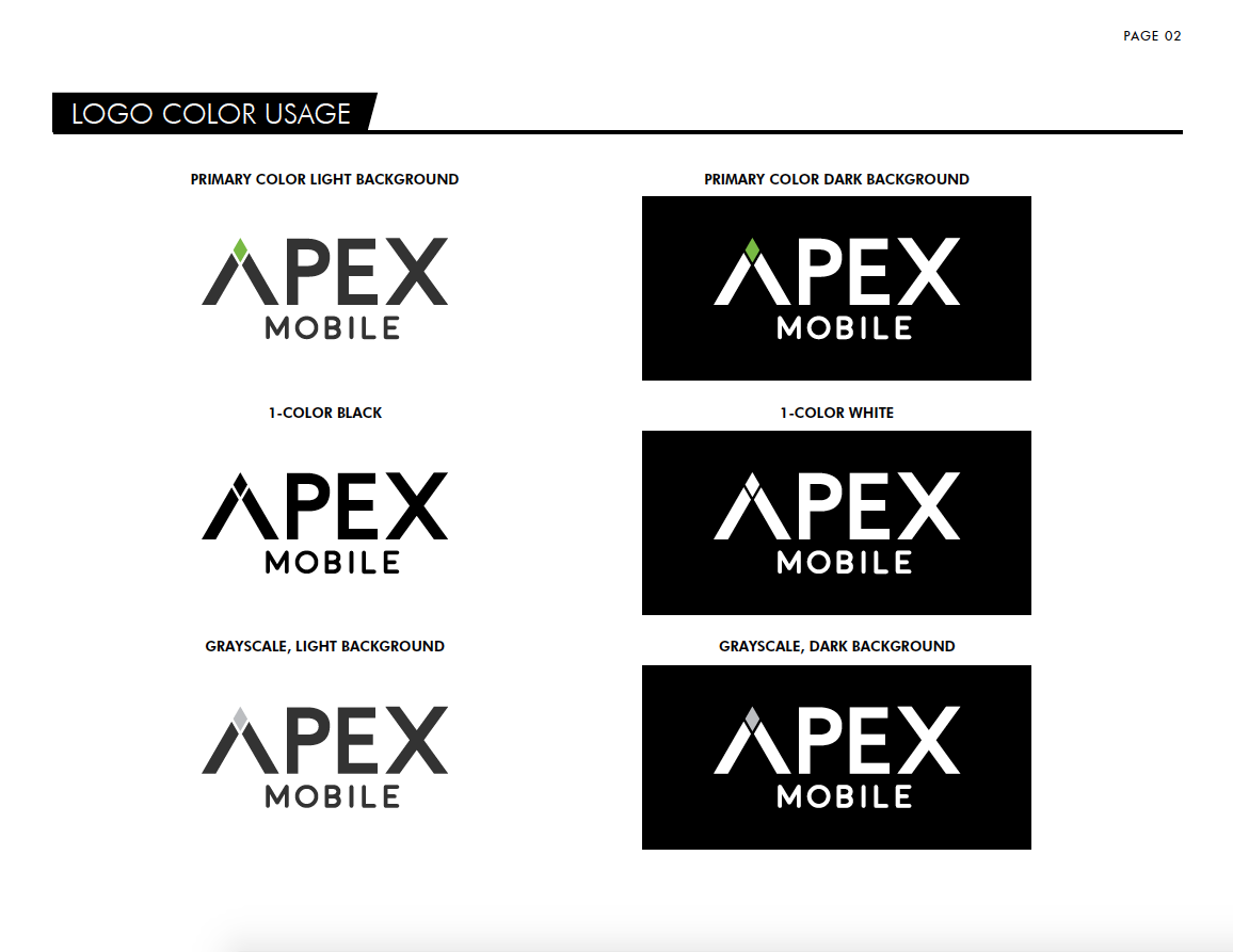
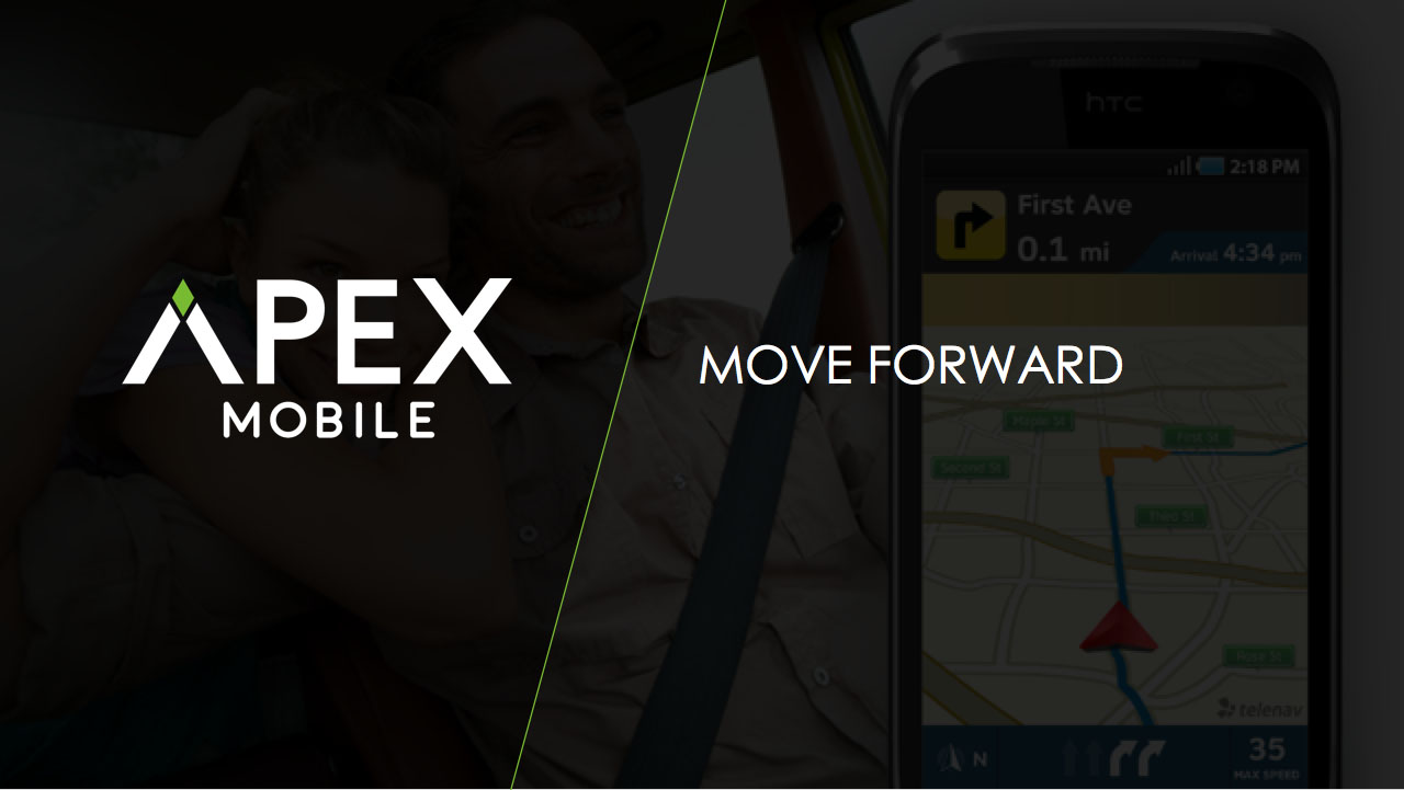
Once a final direction was decided, a mini Brand Book was created to ensure correct and consistent usage of new logo. We also created supplemental brand collateral including Business Cards and Marketing Deck.
Logo
Process
Here’s the first round of logos that were presented for approval. It’s from these that we honed in on and finalized our final version.
Brand Book
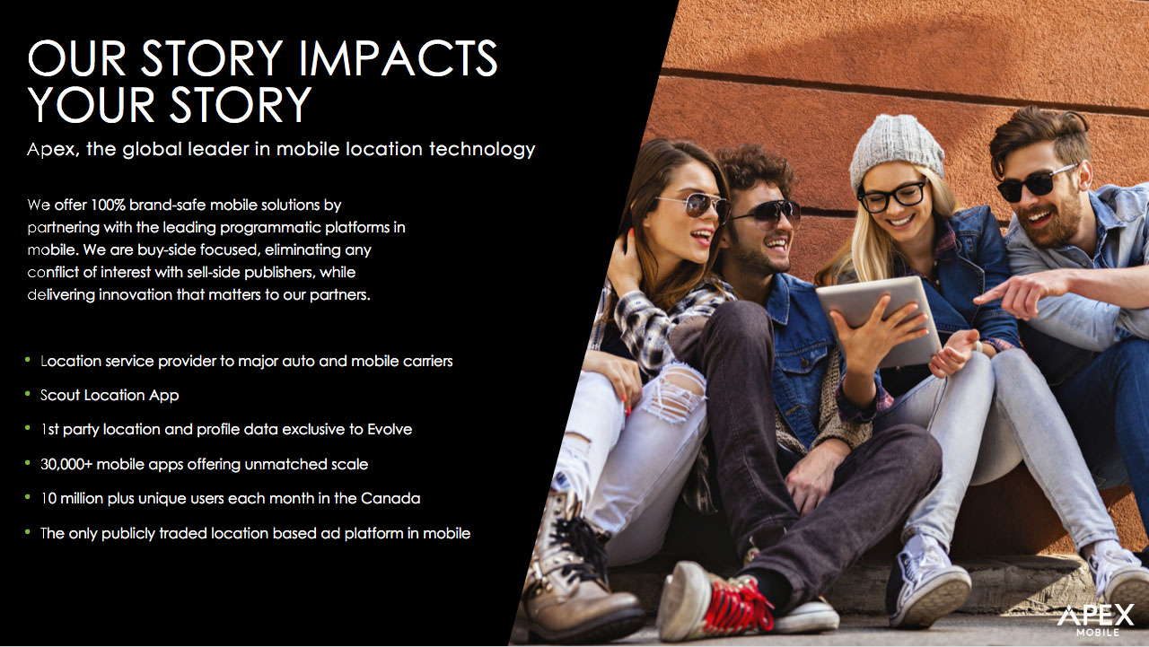
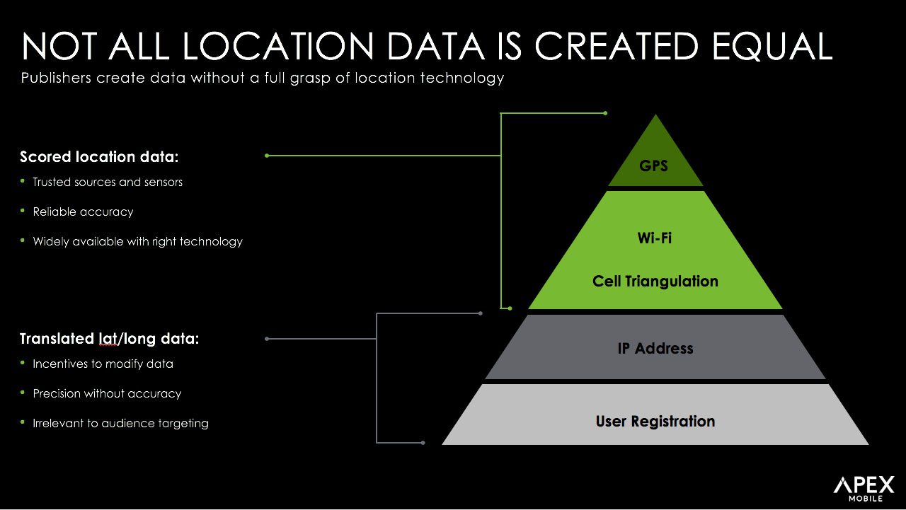
Marketing Deck
Acknowledgement
I do not make any ownership claim to the copyrighted works shown on this page.
- PROJECT MANAGER: Walder Amaya / Chris Lombardi
- DESIGN / DIRECTOR: Jose Inigo
- DESIGN SUPPORT: Yahid Rodriguez, Outsourced Serbian Team